Successful Art and Artist Websites
Do's and Don'ts
How to Build a Website that Works
Related article:
How to Increase Your Website Traffic
Related article:
Website Tips for Artists
The mantra for a successful art or artist website has been and continues to be "Keep it fast, simple, easy and organized." Navigation and content must be clear, concise, and straightforward in order to attract visitors in the first place and keep them on the site once they get there. First-time visitors to any artist website should know as quickly as possible where they are, who the artist is, what their art looks like, what it's about, why it's worth seeing (and hopefully worth buying), and how to move around in order to get wherever they want to go. Sites that lack these basics or make other common errors won't be able to attract and hold visitors, and will likely end up lost in the vast morass of nonfunctional and confusing art websites that overpopulate the Internet.
Before we get going here, and in the interest of anyone who thinks artist websites are outdated and no longer necessary, and that having an Instagram page or social media presence on other platforms is all you need, the sad truth is you have no control over your content on social media sites because they're the ones in charge, not you. They can change the rules at any time, remove posts they deem inappropriate, change their search algorithms, spam you with advertising, become outdated, cramp your style with all their rules, disappear off the Internet, completely change direction, temporarily suspend your account, or at worst, kick you off altogether.
Regardless of how fabulous you think social media is (and it's got plenty of benefits) or how large your following, YOUR WEBSITE IS THE ONLY PLACE ONLINE WHERE YOU CONTROL THE SHOW and no one else. You and only you decide what to post, when to post it, how long it stays there, how to organize it, when to change it, where to put it, when to move it or when to take it down. You can gamble all you want on social media being your sole source of getting attention for your art, but always remember-- having your own website is a sure presence that you'll never lose. It's also what comes up first whenever anyone searches you online, not your social media pages. So in the interest of better artist websites everywhere, here's a list of what to do and what to avoid in order to assure yourself maximum visibility, attention, and an effective web presence online:
Get your own domain name and avoid free web hosting services . Free web hosting is never free and it's always lame. "Free" websites torture visitors with all kinds of distracting advertisements or other obtrusive text and graphics. At worst, maybe half of the screen shows your art while the other half, controlled by the host site, looks like a circus. Your art often ends up in direct competition with all kinds of commercial crap and hardly any art looks good under those circumstances. Furthermore, free sites give the impression that either you can't afford your own website or domain name or worse yet, that you don't care enough about your art to bother buying your own domain and paying for hosting in order to make it look its best online. The good news is that basic websites with good functionality hardly cost anything these days.
Don't use third-party advertising on your sites, especially for goods or services unrelated to your art . Also turn down any offers of sponsored content. Sure, you may make a little pocket change from sponsorship or click-throughs, but any form of advertising is distracting to visitors, will likely have a negative impact on your search engine rankings, and your overall online profile will ultimately suffer for it.
Make sure your website looks the same on Internet Explorer, Google Chrome, Firefox and Safari . The same website can look great on one browser and terrible on another, or worse yet, work great on one browser but be completely nonfunctional on another. Test yours on all major browsers before going public.
Regularly update your site and keep it updated . Don't think that just because your social media pages are current, you don't have to worry about your website. People will continue to visit, and you have to be ready for that. A site that's not current gives the impression either nothing much is happening with the artist's career, they're not that serious about being artists, or that they're not making new work. People visit your site to find out what's happening now, not what happened three years ago.
Your website should navigate as simply, beautifully, and easily on phones as it does on computers, especially the organization, presentation, and quality of your images . More and more people are browsing the web on mobile devices, and that number is steadily increasing to the point where mobile browsing will soon overtake computer browsing, assuming it hasn't already. You want your art and website to look its best no matter how people access and view it.
Link your website to all of your social media pages (and vice versa) so that visitors can move freely between them as easily as possible . And when you post on social media, link over to specific images or pages on your website as often as possible. Using social media is one of the best ways to drive traffic to your website and it only getting better, but for all the benefits, the one major drawback is that they control how you get the word out about your art, not you. Driving traffic to your website flips that paradigm to where you control the show and not someone else.
Another great advantage of social media is that in addition to getting the word out about your art, it's also an excellent way to present yourself on a personal level, engage with your audience, and offer a glimpse into the artist behind the art. The more people can connect with you as a person, the more they'll connect with your art. Give them a sense of who you are, what you stand for, how you are to interact with, and what your artistic life is is about, and you'll increase their interest in heading on over to your website to find out more.
Present yourself and your art in ways that anyone can understand . Make sure your art is organized in ways that are easy to appreciate and access. People who already know you have no problem getting wherever they want to go; they're all taken care of. It's the complete strangers you should pay the most attention to, those who are introduced to your art for the first time, like what they see, and decide they want to see more. This includes anyone who lands on your site by chance or accident. Your website is all about exposing your art to new audiences, welcoming them, convincing them your work is worth paying attention to, and ultimately converting them into fans. So whenever someone new visits your website, make sure you get them where they want to go with as little effort as possible.
Make your site easy to navigate . Some website formats are far too confusing, have dead-end pages, or have gallery sections that seem more like medieval mazes. Visitors get lost, and lost visitors mean lost sales. Make sure every page on your site is linked back to major pages like your homepage, gallery or portfolio, bio, resume, and contact and purchasing information.
Keep your main menu options to a minimum
. Some artist websites have so many menu options that visitors have no idea where to start or where to go and are overwhelmed with choices almost before they even start clicking. A website with too many menu options confuses people and gives them a perfect excuse to leave. The most important main menu categories are:
1. Your Gallery or Portfolio link (with dropdown options to individual series or bodies of work as necessary).
2. Your Artist Statement or "About the Art" link.
3. Your Bio or "About the Artist" link.
4. A link to your Resume or CV.
5. Purchase or Buy link containing complete ordering, shipping and payment information for potential buyers.
6. Your Contact Information.
Text explanations and introductions to your art are extremely important, but keep the word count to a minimum . This includes your statement, bio, descriptions of bodies of work or mediums or techniques, and so on. Being brief with words gets people into your galleries to see your art as quickly as possible (that's why they're here). Overwhelm visitors with words and you'll bore them right off your site. Quick concise introductions and descriptions are best; anything over 150-300 words can get tedious (unless there's a strong cognitive component to your art). The fewer words you can use, the better.
If you can say it in a couple of sentences or paragraphs, that's great. If you want to provide detailed information about either yourself or your art, link to pages where people can read more there, rather than putting boatloads of text on high-traffic areas like your homepage, statement or bio. People who want to know more will click over to the text pages; those who don't can click right over to your art without getting bogged down by oceans of verbiage. Always remember-- people visit your website to see your art, not to read your life story.
Organize your art into groups or series of related works . If you show too many different kinds of art on the same gallery page, you'll only end up confusing people. The "something for everyone" approach often backfires and instead becomes more like "nothing for anyone."
Think of your website as a museum and yourself as the curator. Just like in a museum, make sure that similar works of art are all on display together, each group in its own gallery.
Accompany each series or body of your work with its own introductory explanation . Keep it short-- perhaps two or three paragraphs at most, preferably less. Briefly welcoming people to different bodies of work will deepen their understanding and experience of what they're about to see. Also keep in mind that Google and other search engines cannot search images, but they can search text. Providing textual explanations of your art, either accompanying groups, series, or even of individual pieces, increases the chances that images will come up in online searches, be seen, and hopefully clicked over to. To repeat-- image pages with no text will not come up in online searches.
Make sure each and every every image of your art, is searchable on Google and other search engines (aka is accompanied by text) . The more chances people have to land on your website as a result of online searches, the better. For every work of art, include the title, medium, dimensions, a brief description (only if relevant or necessary), and any other relevant details.
Use informative page-specific title lines . The title line consists of keywords that accurately and specifically describe a page's content, like a news story headline tells what you're about to read. Many artist websites completely waste title line opportunities using the exact same line on every page of the site, like "Mike Miller art" or "Judy Smith artist." The title line, in case you don't know, usually appears at or near the top of your browser window just outside the page, usually on index tabs or tab bars, not in the content of the page itself. It's one of the most important lines on a webpage and often the line that appears in search results. Each title line on each individual page of your website-- and on each individual image if your site is designed that way-- should be unique, specific and descriptive of the contents on that page. This way, each page will have a slightly different appearance on search engines, meaning more matchable keywords, and more opportunities for your website to appear in search results, which will hopefully translate to more visitors to your site.
Keep image sizes reasonable and don't put too many images on a single page . Large detailed images of your art may look great as they download over high-speed connections, but remember that many people still have slower connections. Long downloads frustrate visitors and force them off your site, so use images no larger than 100K-250K, preferably smaller. Photoshop and other image editing programs have formatting options to reduce image sizes without significantly compromising their quality. Learn how to use them. The same holds true for image pages. Too many images on a single page can take a long time to download, longer than some people are willing to wait.
Don't put links to other websites on your site . Some artists think that links pages are a good idea, and put links to their favorite artists or galleries or art pages, etc. What this does is give visitors excuses to leave your site and explore other sites that they might end up liking better. Once people land on your website, you want to do everything in your power to keep them there, not invite them to leave and go elsewhere.
NEVER require visitors to join, register, get passwords or fill out any forms of any kind in order to see your site . Forcing people to identify themselves before they can see your art is a horrible idea. Imagine if people had to show their driver's licenses or other forms of ID in order to visit bricks-and-mortar galleries or artist studios. If it doesn't happen in real life, it shouldn't happen online.
Don't overuse "cookies" (small files that attach to computer hard drives, track people's movements around your site, and collect personal data) . Cookies are occasionally necessary when filling out certain forms, when buying art using "shopping cart" services, or for purposes like tracking visitors around your website to see which pages they visit the most. Again, if people want to contact you, they will. Don't overdo efforts to extract personal information without their knowing it.
Avoid plug-ins, special effects, audio, complex visuals, and similar gimmicks that have nothing to do with your art. Websites that use these often take longer to load, require special software or, at worst, crash visitors' computers. Unless your website is designed to be a work of art or a performance piece in and of itself, and exists primarily for entertainment purposes, avoid the fancy stuff. Web designers may push for special effects, but when you get right down to it, they're totally unnecessary, counterproductive to your ends, and mainly about them showing off their technical skills rather than effectively presenting your art. Remember-- people visit your website to see your art and see it fast, not to sit through your web designer's fantasies.
Provide adequate contact information . The more you tell people about yourself such as your cell phone number, email address or other details like your studio address, the more accessible you appear. Don't give potential buyers the impression that you're hard to communicate with by showing nothing or just just a form, and not even telling them what part of the country you live in. Way too many artist websites provide absolutely no contact information whatsoever, but rather have these awful feedback or comments forms that you fill out and submit. People who fill them out have no idea where they go, who gets them, if they even go anywhere at all or whether they'll ever get replies. The questions that always go through my mind on these sites are, "What is this artist trying to hide?" or "Why are they making themselves so inaccessible?" The overwhelming majority of people who buy contemporary art appreciate a sense of knowing who they're buying it from. So don't be a stranger; anonymity is not a selling point.
If you have no consistent long-term gallery representation, price every piece of art on your website for sale , assuming you have no conflicts with galleries or others who periodically represent or sell your art. If you have representation, ask whether they'll allow you to put prices on your website, or at least on art they're not representing. If they don't want prices, don't price (hopefully they're selling enough of your art to make up for not wanting you to sell it on your own).
For those of you who are independent or who have no representation, not pricing your art on-site, but rather asking people to email or otherwise contact you for prices, is always a big mistake. Many buyers and collectors are not comfortable asking, and you don't want to miss out on sales to them. You don't have to put a price next to every single piece of your art, by the way; do like the galleries do. On the "Purchase" or "Buy" page, have a price list available where people can easily see how much everything costs. Or if you price according to size or subject matter, have all of that explained along with corresponding prices. You'll only lose potential sales if you don't price your art... guaranteed.
Just like in real life, many people prefer to shop for art quietly by themselves, decide whether they can afford it, and then make contact. People are reluctant to ask prices when they're not posted for a number of reasons-- they think that doing so might obligate them in some way, that they'll get a hard sell, that they'll get a barrage of emails, that they'll be embarrassed if they find out the art costs much more than they can afford, that artists will quote as high a price as possible just to see how much they can sell it for, and so on. When you're out shopping, do you like having to ask how much something costs or do you prefer to see the asking price in advance? Do unto others...
Be able to justify or explain your selling prices if someone asks . Everyone likes to feel they're spending their money wisely-- especially these days-- so either provide basic information about how you price your art on your site, or be prepared to field questions about value if people call or email you. People who don't understand how you set your prices or why they're as high or as low as they are will be more reluctant to buy than people who do understand. So make your pricing easy to understand.
Offer approval, return and refund policies . Online art shoppers may want to see art on approval first and be able to return it for complete refunds (less shipping costs) if it doesn't look like they thought it did when they saw it online. No approval, return or refund policies mean fewer sales. The more willing you are to work with buyers, the greater your chances of selling art. FYI, in conversations that I've had with people who sell art online, very few people ever return it once they buy.
Provide clear concise instructions on how to buy . Tell people what payment methods you accept (accept as many as possible), how you pack, how you ship, how long they have to view the art on approval, and so on. The more professional you appear, the more comfortable people feel about buying from you.
Offer art in a variety of price ranges . Online shoppers tend to start slowly, tend to buy less expensive pieces from artists they don't already know, and will likely get discouraged if every piece they see costs thousands of dollars or more. This is especially true of people who visit your site for the first time and like what they see. Offering art at a variety of price points gives all of your fans a chance to own something no matter what their budgets or how familiar they are with you. So make sure pretty much anyone who likes your art enough to want to own it will be able to afford something.
Don't mix art that's already sold with art that's for sale . Some artists think showing numerous sold works of art on their sites alongside art for sale makes them look good and will incite some kind of buying frenzy, or give people the impression that they better buy now "before it's too late"-- but the effect is often the opposite. Potential buyers instead get the impression that the best pieces are already sold and all that's left are the crumbs. They get frustrated when the selection is limited or when all the "good stuff" is gone or when their favorite piece is already sold. It's kind of like going to a garage sale at the end of the day and picking through the leftovers.
You can still show sold works if you want, but put them under a separate category in your "Gallery" or "Portfolio" link titled "Select Past Works" or something similar. Here you show the best of the best-- art that's won prizes or has been exhibited at established juried shows; art that's in private, corporate or institutional collections; art that's been featured in reviews or pictured on websites or blogs or in hard-copy publications, and so on. Showing past works in this way acts as sort of a pictorial resume and speaks to your experience, success and credibility as an artist.
Don't show every work of art you've ever created . Nobody needs to see experimental pieces that didn't quite work, one-offs that you don't intend to follow up on with additional related works, older pieces that have little or no bearing on what you're doing now, student works, and so on. Too much art and too much variety is confusing to visitors because they can't get a sense of who you are, what your art represents, or is intended to signify or communicate. Remember-- people rarely buy from artists whose art they can't understand. Keep it simple; keep it current; keep it related.
***
One of the best ways for you to get the word out about your art is through your website. Make sure yours is working on your behalf and that anyone anywhere who lands on it-- whether on purpose or by accident, whether they know you or not-- can get up to speed about where they are, what they're about to see and experience, and be able to click on over to your galleries as quickly and effortlessly as possible. A welcoming website pays dividends in all kinds of ways.
Do you need help with your site? Would you like more traffic? Do you wonder whether it can be better than it is now? I do website consults with artists all the time. I'm always available to go over yours, make specific recommendations on ways to improve it, and increase traffic and engagement with visitors. Email alanbamberger@me.com or call 415.931.7875 if you have any questions or are interested in making an appointment.
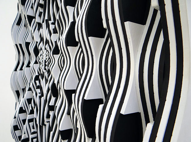
(art by Ara Peterson)

Current Features
- How to Buy Art on Instagram and Facebook
More and more people are buying more and more art online all the time, not only from artist websites or online stores, but perhaps even more so, on social media ... - Collect Art Like a Pro
In order to collect art intelligently, you have to master two basic skills. The first is being able to... - San Francisco Art Galleries >>